Exploring Siegel+Gale’s logo study
If you’ve ever wondered what makes a logo sticky, unforgettable even, you’re not alone. Branding firm Siegel + Gale wanted to know too, so they launched an online study with 3,000 consumers in the US and UK, asking them to evaluate logos for more than 100 of the world’s largest brands.
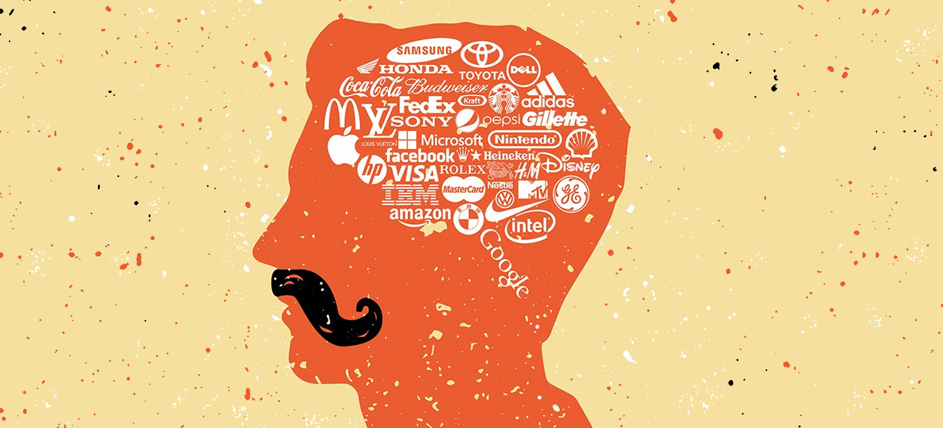
According to the study, logos that are most memorable to the general public use a clear and simple design. Nike, Apple, McDonald’s and Coca-Cola are the most memorable global logos; Google, Microsoft, Pepsi, Amazon, Target and Adidas round out the top 10.
"Simple was the word that came up above and beyond, more than anything else," states the report "When people were asked what makes a logo memorable, it was simplicity."
Simplicity makes a lot of sense to me as a designer, throughout all human history we are drawn towards simple shapes and icons. These appear in the marks we made as cavemen, the icons we choose as national emblems, and the strength and proliferation of religious shapes. Its no surprise that simple shapes and colours, that have been hounded into us since kindergarten, appeal to us the most. They are easy to understand, and we like ease.
“We now have a benchmark to look at what design can do,” states the report. The interesting thing to note is that the study shows that people are more likely to respond positively to familiar logos and negatively towards new logos.That bias helps explain why consumers react so strongly to brands like Verizon’s or Google’s logo redesigns. What’s great about this is it now gives us a benchmark to discount that familiarity bias and really evaluate if logos are doing the job they should be doing.
As a designer this makes my job harder when creating new brands, or doing a redesign for a brand. It means not only do we have to do a very good job, but we also have to be willing to come out of the gate fighting, knowing we’ll be at a disadvantage in the eyes of consumers. This is not necessarily a bad thing, but interesting to note that the work I do will be overall poorly received until it becomes familiar.

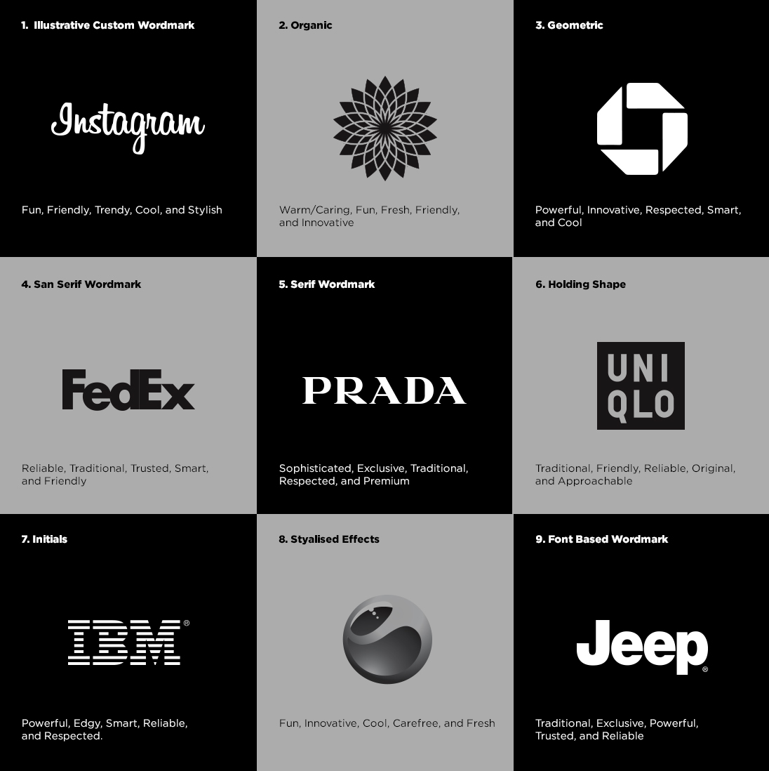
What I really liked about the study was that it broke down brand logos into 9 primary categories (see the images below). Each category has been linked to 5 top traits that a brand can use to evoke certain personalities which connect with consumers. So moving forward in logo design or redesign it helps reinforce stereotypes that can be used to help bolster creative decision making.
